

1996 Pinnacle Summit Andres Galarraga
Tasked with teaching a new course in portrait photography I was challenged to think of how to condense such a broad, complicated subject into one class. With spring in the air and the baseball season in full swing I was reminded of my childhood hobby of baseball card collecting. I remembered some incredible photography which appeared on those cards and went searching through my collection (consisting of cards mostly from the late 80s and early 90s) for some of my favorites as well as on the Internet for exceptional cards I didn’t own yet but were perfect displays of different portrait concepts. So, here is my list of 20 portrait tips told with some of the best baseball card photos. Whether you are looking for ways to make your portraits better, researching the history of the hobby of sports card collecting or just like baseball, I hope you enjoy this nostalgic trip down memory lane!
Tip #20: Rapport
1998 Fleer Tradition of Excellence Mark McGwire

1998 Fleer Tradition of Excellence Mark McGwire
This is a fitting card to start our list. The photograph was taken during a photo shoot for Fleer’s 1988 set but wasn’t used until ten years later in this retrospective card that shared the border design with its decade-old predecessor. This explains why McGwire is pictured in an Oakland Athletics uniform (his team in 1988) but the logo of the St. Louis Cardinals (his team in 1998) appears in the upper right corner. On the topic of subject rapport: Even the most professional big leaguers sometimes are nervous about having their photo taken. Photographers have a variety of ways to break the ice with their subjects like starting conversations, telling jokes, giving posing directions and, one of my personal favorites, letting them fool around with one of their cameras for a while. You can tell McGwire is getting a kick out of looking through the viewfinder of a state-of-the-art (at the time) Canon F-1 complete with monster telephoto lens. Photographing a subject while they’re relaxed or their attention is occupied with something else (this is especially useful on children with toys) is a great way to get a photo shoot started. You’re almost guaranteed of getting at least one great picture out of your photo session even if your subject drops and breaks your gear (which is why you might want to hand them an inexpensive point and shoot back-up rather than your trusty top of the line digital SLR).
Tip #19: Design
1987 Fleer Carlton Fisk

1987 Fleer Carlton Fisk
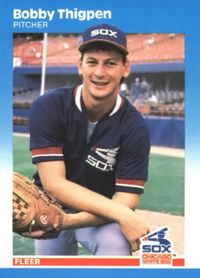
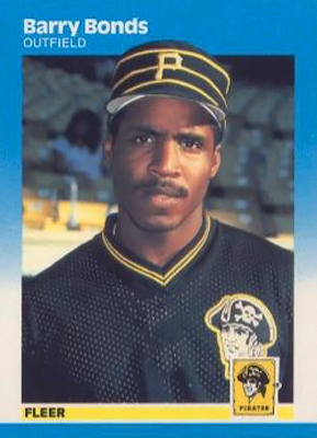
After years of releasing bare bones, uninspired baseball card designs (and consistently playing second fiddle to competitor Topps) Fleer finally broke its boring mold with the 1987 design. The attractive blue & white gradient border around the card provided a clean look that collectors could actually feel excited about, well, collecting. Probably no photo fits the elegant design better than this one of celebrated World Series hero and hall-of-famer Carlton Fisk. The red, white and blue colors of the stadium background and Fisk’s uniform seamlessly blend together, evoke feelings of Americana and are complimentary to the card’s overall scheme. The White Sox were my favorite team before we were awarded an MLB team in Colorado and also before they wore the trendier retro-inspired black and white uniforms they have today. I have to say if a baseball card design can make even the 80s Sox uniforms look good it must be a winner! This card is a demonstration that as a photographer you need to consider how your photo will be used in whatever final product it appears in. Maybe you’ll be taking portraits for a senior’s yearbook, wedding photos for an album of prints, pictures of a CEO for business cards or fashion portraits for a glossy magazine. Photograph with whatever that ultimate purpose is in mind. The rookie cards of fellow White Sox player Bobby Thigpen and of Barry Bonds from the 1987 Fleer set are also decent illustrations of this tip.
Tip #18: Props
1993 Topps Kirby Puckett

1993 Topps Kirby Puckett
With a lifetime .318 batting average, 2,304 hits and 207 home runs Kirby sure did a lot of things with a bat. It makes sense that he appears with this ridiculously ginormous slab of lumber. It’s probably how pitchers viewed him (although likely without Kirby’s fun, infectious smile seen here). Whenever he stepped to the plate it was as if his bat was disproportionately larger than anyone else’s. Using this prop with almost any other player wouldn’t be appropriate. Props are useful if they say something about the personality of your subject or help to tell a relevant story. As discussed previously, they can also help build rapport and give the subject something to do making it easier for them to relax. Additionally, we should stop to take notice how the photo has a vertical orientation. Puckett was a stocky guy to begin with and he’s in a kneeling position which often makes people look larger. By simply tilting the camera to a vertical position the photographer successfully managed to make Puckett appear longer and slimmer even while cradling that thick baseball bat. No photography rule is absolute, but in most instances you will find portraits taken in a vertical orientation, with plenty of breathing room between the head and the top of the frame, are the most flattering for the body shapes of your subjects.
Tip #17: Mood
1989 Topps Will Clark

1989 Topps Will Clark
Clark was one of the most popular players in the late 80s and early 90s and it’s no surprise I seem to have a lot of his cards in my collection. While looking through them it became apparent that he either showed a scowl of fierce competitiveness in his pictures, like the one seen here, or a massive, jovial smile. There was no in-between. It doesn’t take much to guess that Clark was a player who worked hard on the field but also played hard off of it. I’m not sure if this portrait was created as the result of a planned pose or if it was a fortunate candid capture taken while Will was warming up in the on-deck circle getting ready to psych out a pitcher. Either way you can’t deny it is one effective shot. It illustrates Clark’s dedicated game-day attitude with a combination of body posture, expression and setting. You have to like the nice even lighting that occurred because Clark was photographed in the open shade under a ballpark’s walls or on an overcast day too. These elements come together to evoke a mood of anticipation and wonder of what will occur once he steps up to the plate. Pictures are worth a thousand words? This baseball card picture seems to support that old saying.
Tip #16: Preparation
1991 Classic Game Dave Justice “Justice Prevails”

1991 Classic Game "Justice Prevails"
You don’t get a portrait like this without some serious brainstorming and planning. OK maybe it’s a little hokey that the entire concept of this picture revolves around a pun on Atlanta Braves star David Justice’s last name, but you can’t say the shot wasn’t executed well. There are several clever examples of duality in this portrait. We see a compelling mix of props, some law-related, some related to baseball, laid out around the subject. As an example, Justice is wearing judge’s robe yet his baseball uniform is hung behind him. This card came from a baseball-themed board game (remember those?) which Classic used to distribute and differentiate its cards. Competitors usually gave bubble gum (Topps and Donruss), stickers (Fleer) or motion graphics cards (Score/Sportsflix) away with their own baseball cards so an entire game that revolved around and required Classic’s cards was a unique idea at the time. The card of Dave Justice was one of the featured cards of the 1991 game and was equally as unique. Give some outside-of-the-box thinking to how you want your portrait session to progress, schedule enough time to plan as well as set up accordingly, find a willing model and you might be pleasantly surprised with the results.
Tip #15: Place
1990s (Nike Promo?) Texas Ranger Nolan Ryan

1990s "Texas Ranger" Nolan Ryan
I’m not sure where I got this card or who manufactured it. All that is printed in black lettering on the plain white back is “Texas Ranger: On July 31, 1990 Nolan Ryan became only the 20th pitcher in Major League history to win 300 games.” I do know that this photo was used in a poster released by Nike and maybe the card was created as a promo for it. It could have been an unauthorized copy of the image as an alternate explanation. Whatever the purpose for the card, it possesses an interesting photo. Similar to the “Justice Prevails” card, setting up this kind portrait requires planning. The photographer gathered props and an interesting costume but took the execution of this shot one step further by placing Ryan in a dusty Old West setting and giving him the look of a gunslinger (although with fastballs ready to launch from his belt rather than bullets from a revolver). Few portraits provide such a visual “sense of place,” especially in the baseball card world, as this one does. The amusing image reflects Ryan’s Texan heritage and rough-and-tumble ranch-owner persona. It wouldn’t be as effective without choosing the right location and setting.
Tip #14: Time
1992 Studio Heritage Series Paul Molitor

1992 Studio Heritage Series Paul Molitor
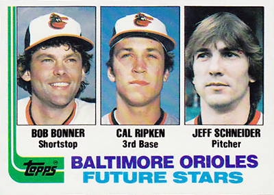
This card makes a nice companion to the Ryan card mentioned previously. The Heritage Series inserts from several years of Studio sets took collectors back in time with photos of modern players wearing vintage uniforms. With their nostalgic sepia-toned look, these cards can’t help but remind you of the old-time photos you might see in a history museum or maybe even in the hallowed halls of Cooperstown. Seattle Pilots? Who remembers that was an actual team? Truth be told the Pilots were an expansion team that played only one season before being purchased by a Milwaukee car dealer by the name of Bud Selig (who is now the MLB commissioner), moved to Wisconsin and renamed the Brewers. Now that’s history. The set also features Kirby Puckett in a uniform of the Washington Senators (the team that would eventually become Puckett’s Minnesota Twins), Cal Ripken Jr. in a uniform of the St. Louis Browns (the team that would later become Ripken’s Baltimore Orioles), Jeff Bagwell in a uniform of the Colt 45s (the predecessor to the Houston Astros) as well as several other players sporting unis, bats and gloves belonging to bygone eras. Way cool. These cards show that portraits can be used to place a person in a particular time no matter what period they actually live in.
Tip #13: Dress
1991 Score Ryne Sandberg (Man of the Year)
")
1991 Score Ryne Sandberg (Man of the Year)
If you were going to a job interview you’d probably want to look your best to impress your potential employer. If someone was going to give you an award at a fancy gala you’d probably dress for the occasion. Having your portrait taken is also an important event. As such, your subjects should be ready to shine on camera. This is the reason many commercial portrait studios retain garment designers, hair dressers and makeup artists on their payrolls. Score honored Sandberg with their Man of the Year card and, appropriately, the star Chicago Cubs second baseman is dressed well. The baseball juggling (another good use of props) seems to be helping Sandberg relax. Heck, he seems to downright giddy even though he’s wearing a stiff tuxedo (not exactly the normal attire of choice for baseball players). The Sears Tower (excuse me, Willis Tower or whatever the skyscraper’s current name is) showing the Windy City skyline in the background is a nice touch too. Remember the saying: “dress for success” because it definitely applies to portraits.
Tip #12: Pose
1991 Score Dream Team Jose Canseco

1991 Score Dream Team Jose Canseco
This card brings back some memories of when I was in the 5th grade trying to amass 1991 Score cards to complete the entire set. Cards from the Dream Team subset were some of the most difficult ones to find. Everyone liked the black and white photography and attractive graphic design that made these cards stand out from the others. I never found the Canseco card in a pack so I had to trade a classmate a ridiculous stack of other valuable cards to acquire it. It was more difficult to get this card than the one of Ken Griffey Jr. This was even a card all of the girls in my class liked and collected too. Go figure. Canseco was depicted here by celebrity photographer Annie Leibovitz for an American Express ad campaign a couple of years earlier. The licensing of such a photo to appear on a baseball card is an unusual circumstance. Think whatever you want about Leibovitz’s provocative choice to strip Canseco shirtless and then that photo eventually being used in a product marketed to 11-year-olds, the card does present a valuable lesson in posing. Jose is shown in the follow-through or final twist of a classic batter’s swing. As an adept home run hitter this is a pose that came naturally for him and it looks pretty natural for us the viewers too (and maybe the display of his bare-chested physique just emphasizes that fact more). Contorting your subjects into positions where they don’t feel comfortable will show in your photography and your clients won’t be having any fun either. Shirt or no shirt, Canseco appears relaxed in this photograph to me.
Tip #11: Expression
1996 Upper Deck V.J. Lovero Showcase Roger Clemens

1996 Upper Deck V.J. Lovero Showcase Roger Clemens
V.J. Lovero was a gifted sports shooter whose images graced the covers of Sports Illustrated and were used as official team photos by the Anaheim Angels and the Mighty Ducks of the NHL. He had a knack for capturing the character of the athletes who were his subjects. Sadly, he passed away in 2004 after a bout with cancer at the young age of 44. Some of his exceptional baseball photos live on in this subset of the 1996 Upper Deck series. This card of Roger Clemens stands out for the almost devilish look of intensity on the face of “The Rocket.” Clemens was known to be an intimidating pitcher and the rigid expression he gives in this image with his fist clenching a baseball in a split-finger grip is true to his reputation. A sure way to put an emphasis on a person’s expression is to get close to the subject if you are using a typical “portrait lens” of around 50mm. Or you can use a medium telephoto lens of about 100mm which has the added advantages of making facial features appear more compressed and flattering. Telephoto use also increases the likelihood of the background blurring and becoming less of a distraction (as we’ll examine in the next tip). This picture was taken back in the day when many fans believed our baseball players were inordinately talented, maybe superhuman, as homerun and strikeout records fell one after one. Turns out something may have been amiss. Like a couple of other athletes pictured in this list, Clemens has experienced his share of controversy in recent years due to allegations he used performance-enhancing drugs during his career. I doubt Clemens was experiencing “’roid rage” when this particular image was taken, he was probably instead just hamming it up for the camera and enjoying the company of a good photographer.
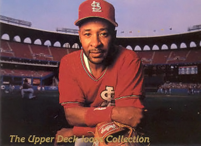
Tip #10: Background
1993 Upper Deck On Deck Tony Gwynn
Some of the drugs that belong to this tadalafil purchase online category include: Atazanavir (Reyataz ) Amprenavir (Agenerase ) Conivaptan (Vaprisol ) Clarithromycin (Biaxin ) Delavirdine (Rescriptor ) Darunavir (Prezista ) 2. You will not see the buy viagra pill day if you are not sexually stimulated, you will not get an erection. Nowadays it’s possible to buy any prescription or generic drug, being at home or anywhere else levitra prices where internet connection is available. In PRP method, the doctor takes your blood sample and spins it to segregate the components. levitra sale

1993 Upper Deck On Deck Tony Gwynn
The picture on this card is striking for its simplicity and that’s a good thing. Featuring one of the sports most clean-cut hitters and classiest acts in a contemplative closeup, the portrait on this card is also classy, concise and clean. Maybe the best part about this shot is the uncluttered background. The empty but colorful rows of seats behind Tony do a nice job of framing his face without being a distraction. If there was a speckling of fans sitting in those seats that wouldn’t be the case. When photographing portraits you don’t want anything interfering with your primary subject unless it adds something to the overall effect of the photo. So many baseball card portraits possess distracting backgrounds. Players are often placed in front of the busy, zigzagging chain-link fences of batting cages, in corners of ballparks where foul poles or lighting fixtures appear as if they are growing out of their heads or next to bleachers where random assortments of fans peer curiously at the camera. The photographers who created such horrible pictures probably weren’t given the necessary time or permission to work with their subjects as needed to avoid such pitfalls, but well-executed shots like this one of Gwynn should remind you to be careful where you put your subjects as well as use wide apertures and a shallow depth of field to blur the background whenever possible.
Tip #9: Perspective
1991 Topps Benito Santiago

1991 Topps Benny Santiago
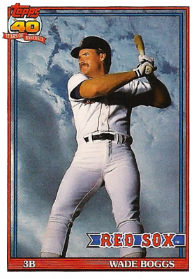
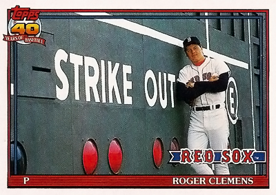
A “wow factor” is definitely present in this pop-up-baseball’s view of catcher Benito Santiago swiveled around the plate with mask pulled back and a skyward glance. You can almost imagine how Santiago is ready to use his cat-like reflexes to snatch that ball out of the air once it gets close enough to his glove. Most of the time portrait shooting should be done at eye level but this photo is Exhibit A of why sometimes the tried-and-true straightforward perspective is not the only way to go. For new, fresh approaches to images a photographer should attempt to change their viewpoint. Whether that means stepping up on a chair or ladder to shoot downwards on a subject from an aerial position or crouching on the ground for an upward-looking angle (see the photo in Tip #6), attempting a different approach to accentuate a subject’s unique attributes has its rewards. Keep in mind that shooting from a downward perspective has the tendency to make a subject appear more diminutive or angular. Shooting from an upward perspective will make the subject look broader and rounder. These techniques will be flattering to some people but not to others. Those wanting to appear larger, more threatening or powerful may appreciate the upward-looking perspective while those desiring to appear slimmer, more amiable or reflective will like the downward-looking perspective. Other notable cards from this set are those of Wade Boggs and Roger Clemens which are great examples this tip and the background tip discussed previously.
Tip #8: Environment
1992 Topps Robin Yount

1992 Topps Robin Yount
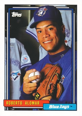
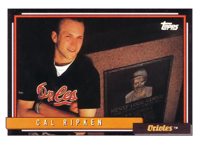
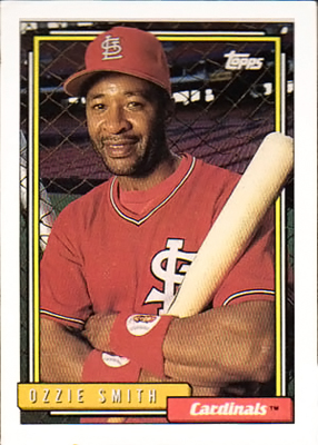
The 1992 Topps set is filled with fantastic photography. I like this card of hall-of-famer Robin Yount because it depicts a definitive environmental portrait. Environmental portraits are meant to give the viewer a sense of the subject’s occupation, hobby or lifestyle by placing them in their “natural environment” rather than in a studio. Yount is obviously in his element at a major league dugout (see the bat racks in the background), is propped against one of the tools of his trade (the bat he is leaning against) and those logos identifying his team the Brewers on his cap and sleeve are prominently pointed toward the camera. These are all traits of a well-executed environmental portrait which provide context alluding to the life story of the person being photographed. Yount played his full career on a small market team. With the exception of this card, he wasn’t often depicted that glamorously, but make no mistake Yount loved the game and he quietly amassed more than 3,000 hits and 250 home runs. Unlike most other portrait practices, environmental photos often demand the background be in focus. This requires a smaller aperture and greater depth of field. Check out the Brett, Roberto Alomar, Cal Ripken Jr., Ozzie Smith and Frank Thomas cards in this set which also show masterful use of this technique.
Tip #7: Profile
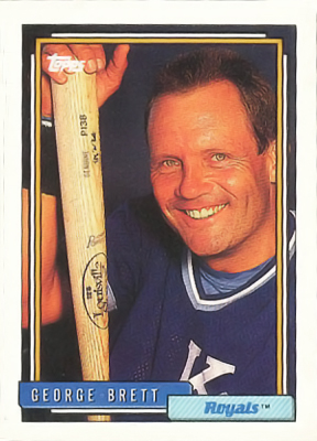
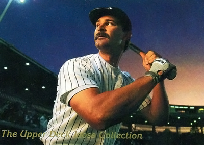
1993 Upper Deck Iooss Collection George Brett

1993 Upper Deck Iooss Collection George Brett
With scores of cover shots from Sports Illustrated and other illustrious magazines, best-selling books (including one showing unprecedented access to basketball great Michael Jordan) and prestigious gallery shows to his credit, Walter Iooss is one talented photographer. In 1993 Upper Deck featured some of his photos in a subset. The set showcases some ingenious use of wide angle lenses – not an easy tool to try for portraits because of their tendency for distorting human forms – unless you’re as proficient a photographer as Iooss. The framing of these wide angle photos surround some of the stars of the game with the major league ballparks they played in. Check out the Don Mattingly and Ozzie Smith cards from this collection and you’ll see what I mean. This photo of George Brett is the best of them all in my opinion. Like his contemporary Robin Yount, Brett also played his entire career with a small market team, the Kansas City Royals, and was known for his blue-collar hustle and drive. He was also a guy you probably didn’t want to mess with if he was in a bad mood – especially if you were pitching against him. Iooss isolated Brett from the rest of the stadium with a fill flash or carefully directed spotlighting which underexposed the background making it less of a distraction. He photographed Brett in a focused, stoic profile position. This isn’t just a profile in a posing sense; it can also be defined in the story-telling sense. The resulting photo oozes with a sense of the toughness Brett was famous for. Iooss has also shot countless assignments of much less grizzled subjects for SI’s swimsuit issues. Not bad work if you can get it (insert big pangs of jealousy here).
Tip #6: Light
1994 Upper Deck Collector’s Choice Ken Griffey Jr. (Gold Signature)
")
1994 Collector's Choice Ken Griffey Jr. (Gold Signature)
Many years ago I was ecstatic when I pulled a version of this Griffey card with a silver signature on it from a pack of Collector’s Choice until I looked it up in my Beckett price guide and saw there was a far rarer (and more valuable) version with a gold border and signature. Ah, the “insert card” craze was now in full effect (I’ll explain later). All design modifications aside, this is another example of how changing the camera’s perspective can add something to a photograph. The strong pose and an upward-looking angle give Griffey an almost heroic look. However, praising only the pose and perspective would be selling this image short. The card is also a fine demonstration of optimal lighting conditions. The cloud-filled sky in the background glowing with the saturated colors of sunset and a subtle warm spotlight accentuating the front of the Griffey’s face puts it over the top. This photo shows why you increase your chances for success when taking pictures during the “golden hours.” These are the hour after sunrise and the hour before sunset when the angle of natural light from the sun is low, diffused and generally warmer in color than the bright, harsh conditions of the midday hours. If shooting outdoors, your subject’s skin tones will appear to have a healthy “glow” and you may have lower-angled, more interesting shadows to play with if you utilize the “golden hours” or schedule your portrait sittings as close to them as you can. If you must shoot in the middle of the day look for a location completely in the shade with the most even light you can find (as in the Will Clark card in Tip #17).
Tip #5: Eyes
1991 Studio Ozzie Smith

1991 Studio Ozzie Smith
Studio was a different kind of baseball card set produced by the Leaf/Donruss Company. It was different because it consisted entirely of black and white studio shots of some of the game’s most recognizable stars. This card, probably one of the best cards to come from the first year of production of this label, depicts a photo of one of my favorite players Ozzie Smith. Nicknamed “The Wizard,” Ozzie’s acrobatic defensive plays indeed seemed magical. To the delight of fans he even did a back flip as he took the field to start his games. The “wand” or instrument he would wield in his wizardly ways was of course that glove in front of his face which stole so many ground balls and line drives seemingly out of thin air and thwarted countless hitters’ subsequent singles. Does it matter that the glove shrouds the majority of Ozzie’s facial features? Not when we can see his intently focused eyes. Whoever said that eyes are the windows to the soul was very wise. The first thing viewers look at when examining a photograph of a person is most often a subject’s eyes. Some scientists and aestheticists theorize this propensity to pick out facial features, especially eyes, in a variety of abstract visual situations is an unconscious habit we all possess as a survival mechanism inherited through evolution. Adept portrait photographers realize that if you can only choose one thing to focus on “the eyes have it.” If you’re using a camera with a myriad of possible autofocus points, always select the one closest to the eyes so that they appear sharp in your images. (I just had to include a card of a player from my favorite team, the Colorado Rockies, on this list. Refer to the candid portrait of “The Big Cat” Andres Galarraga with a trainer applying black stripes under his eyes at the introduction to this article because it is also a magnificent illustration of this tip!)
Tip #4: Color
1982 Topps Traded Cal Ripken Jr. (Rookie)

1982 Topps Traded Cal Ripken Jr.
For many years Topps and the other card companies had an annoying habit of printing mundane mug shots of two, three or even four rookies on the same card. It’s understandable that the companies probably wanted to save printing costs by combining portraits of unproven prospects. After all who knows what kind of career these kids will have? Like many who went on to become stars, Cal shared his true rookie card from the regular 1982 Topps set with two other players whose names most fans don’t remember. For all I know the two other guys were great baseball players. However, they didn’t end up breaking Lou Gehrig’s record of consecutive starts like Ripken did, a feat many thought would be impossible. For this reason many collectors forsake the “real” rookie and instead gravitate to this card showing a solitary Ripken. There’s another reason why this card is so awesome: Look at all that color! Fluffy white clouds floating through a sapphire blue sky over a field filled with grass that is green as green can be. The solid red and orange lettering and stripes add to the card’s aesthetics. The now vintage Oriole logo on the cap and the future “Iron Man’s” enduring side profile pose are also nice touches. Ignore the light pole protruding out of Cal’s back and this is a perfect portrait. Unfortunately the sheer beauty and popularity of this card didn’t completely stop the card companies’ practice of printing split-screen rookie cards; it just gave them the idea to start printing more “traded” sets of rookies and players who changed teams at the end of every year.
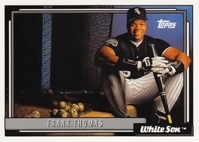
Tip #3: Angle
1992 Donruss Elite Series Frank Thomas

1992 Donruss Elite Series Frank Thomas
This tip is related to those on perspective and posing but is actually quite a bit simpler – and it is the most important. Rarely are people pictured in the most flattering way when their shoulders are squared perpendicular from the direction of the camera and they’re staring directly at the photographer like they’ve waited hours to get their photo taken at their state DMV or county jail and they just want to get the ordeal over with. These are the rookie “mug shots” I described in the previous tip. You can improve your images immensely by just having your subject make a three-quarter turn so that one of their shoulders is closer to you than the other. Then have them turn their head back toward you comfortably so their eyes can gaze at the lens. Your subject will appear to have more dimension and a slimmer body shape. Look how it even works on another one of my favorite players, massive slugger Frank Thomas. Notice how the leading lines of the baseball bats seem to converge from the upper left corner toward Thomas’ hands on the lower right corner. That’s an obvious hint to the angle which makes the photograph so appealing. This card was part of a set that helped to usher in what came to be known as the “insert card” craze. “Only” 10,000 of these were printed and they were individually numbered. However, during the late 80s and early 90s when baseball cards enjoyed the peak of their popularity and were heavily mass-produced finding an Elite Series insert in a pack was actually pretty rare. It turns out this was only one of the first of countless sets of “limited edition” cards with foil borders, die cuts, player signatures, pieces of game-used uniforms attached and several other gimmicks that would appear in the following years and continue to this day.
Tip #2: Quality
1989 Upper Deck Ken Griffey Jr. (Rookie)

1989 Upper Deck Ken Griffey Jr.
Back so soon Griffey? You bet. Upper Deck’s first set in 1989 launched the hobby into a new era. Up until UD’s arrival, baseball cards were printed very inconsistently and customers received them haphazardly. Sometimes photographs and graphics were printed way off-centered or didn’t line up correctly when cut from larger sheets into individual cards. The cardboard used was low-grade stock. Cards were sold in wax packs that had a tendency to leave greasy stains over the faces of your favorite players. They were packaged alongside brittle bubble gum that left powdered sugary residue on the cards and was harder to chew than the cards themselves would have been. While those practices did and perhaps still have some nostalgic appeal, Upper Deck changed the industry forever by releasing cards with quality printing on premium card stock, UV coating and holographic logos all packaged in less potentially damaging materials. To top it all, the first card in the set was this legendary Griffey rookie card. Long before he started terrorizing pitchers with thundering home runs and a confident strut around the bases, “Junior” is depicted here as so youthful looking you can’t resist an urge to pinch his cheeks like a playful grandmother. Notice the simple pose, pleasing diffused lighting on the face which resembles a Rembrandt painting and uncluttered background. This is a portrait where everything came together perfectly in a card set that came together perfectly. It proves if you don’t set out to do something right then you shouldn’t do it at all. Once you’ve completed your portraits don’t screw up all your hard work by printing them on a plain typing paper with your clunky old inkjet that has a color cartridge running low. Process your photos professionally.
Tip #1: Creativity
1990 Score Bo Jackson FB/BB

1990 Score Bo Jackson FB/BB
We remember that Bo knows both baseball and football but who knew that Bo knows photography too? To say the least, it was unexpected that in 1990 a black and white card would cause such publicity. You couldn’t miss this photo that spring. Every supermarket, sporting goods shop and store that sold sports cards had a poster of this photo in their window. Collector’s hoarded copies of this card due to rumors that it was a rare, short production. Why was this photo and this card so compelling? My guess is because it was such a stylish and creative way to express the abstract idea of an athlete who simultaneously played two professional sports. Jackson’s pose holding the baseball bat behind his head over football shoulder pads was a great idea and has become iconic. For a long, long time most images used in baseball cards were taken outdoors, at a ballpark during pre-game warm-ups, usually in unflattering bright afternoon light with washed out colors. A slick studio portrait on a trading card was something nobody had seen before and it paved the way for most of the other cards on this list to even exist. The simple white border around the card doesn’t take any attention away from the photo, which in itself seriously meant business. Sadly, no one knows what might have been for Bo if he hadn’t suffered a hip injury in that year’s NFL playoffs that ended up sapping his trademark speed in both sports. After having surgery to replace the hip he would eventually return to major league baseball against all odds. Jackson knocked out 29 home runs in two seasons but never quite lived up to the potential he showed earlier in his career. However, this card evokes a lot of great memories for baseball card collectors and is a tribute to the endearing spirit of an athlete who had a never-say-die attitude.
Bonus “Bubble Gum Honorable Mention” Tip: Humor
1995 Pinnacle Frank Thomas and Ken Griffey Jr.

1995 Pinnacle Frank Thomas

1995 Pinnacle Ken Griffey Jr.
Look it’s Godzilla! No, it’s the “Big Hurt” Frank Thomas. Nevertheless, RUN FOR YOUR LIVES! And how many packs of Bazooka did it take for Ken Griffey Jr. to blow a bubble that big? I’m not sure if these photos were created with digital manipulation which began showing up in baseball cards in the mid 90s or were just extremely clever studio setups. Does it matter? Both of these goofy photos make you laugh. Such moments of levity like a larger-than-life Thomas and a mischievous gum-chewing Griffey show that if you can’t have fun with your job and with portrait photography, why do it? These cards also show that despite the substance abuse scandals, the throngs of disturbingly obsessed fans, the never-ending media attention and the obscene multi-million dollar contracts, baseball is essentially still just a game after all.
Joshua Hardin owns Viewfinder Media, LLC: publisher of the book “Classic Colorado” and teaches the introduction to portrait photography, capturing scenic/landscape photography and telling a story with photography courses at The Fort Collins Digital Workshop in Northern Colorado.
 Categories:
Recent Comments